Disney's SMS Platform

As we're all aware, building technology does not always go as planned. Such was the case for the prototype Disney cast members had to use as their only SMS platform. This meant every SMS sent from Cast Member to guest was written on a system only meant for demo purposes.

happiest place on earth... sucks at texting?

The Problem

With SMS being the number one way park guests requested customer service, the only platform cast members had to serve this influx was a shaky platform built only for prototype purposes.

With problems abound, guests were underserved while cast members were under-informed. The badly deprecated software lacked flow & basic guest information. For example, the platform's only guest history comprised of 1 short note manually entered by cast members... if they remembered to do that while juggling the next guest.

Overview

Team & Methods

Jean Kaluza
UI Design, UX Research
Sarah
Product Manager
Job Shadowing
If the software loaded at all, I sat & watched cast members addressing guest's needs at an agonizingly slow rate.
User Testing
Once we had sufficient enough features built, I was able to convince company to give our work in progress to future users

The Project

The goal of the project was a complete a 1-to-1 redesign of the prototype. That said, the stories included various new features contradicting this goal. Our team also had a strict style guideline to follow & pull from which made wireframes irrelevant. The key became researching thoroughly and then testing our progress as we went.

Job Shadowing

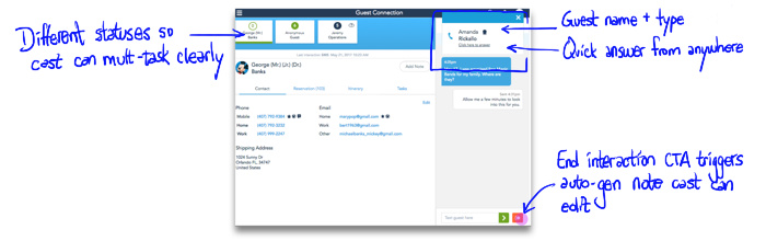
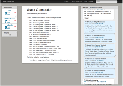
Gross right? This is a screenshot of one of the few screens the current platform had. In disbelief this could be useful at all, I asked to see the current prototype in action ASAP. I sat and watched the biggest team that worked on the platform use it to answer every incoming SMS. It was stressful just watching. 😫Hardly any cast member had time to talk to me. I watched as most of their time was spent looking up guest information & reservations rather than helping anyone!

Luckily, they were all grateful I was redesigning and a few even took the time to do a card-sorting exercise with me.

Business Requirements

Current → New

Since Mickey & business requirements were practically law here, I had to balance them with the real needs I was uncovering. Sarah also made clear the team I was shadowing wasn't my only user base since they hoped one day the tool could be used by literally any guest-facing cast member! #highambitions

Search only by reservations →
search for day guests, reservation guests & internal guests
SMS communication → sms with Standardized & automated legal flows for sms opt-in
voice call → team-level voice mail options
basic text area for notes → integrated notes attached to timeline
basic tasks created for follow ups → both team tasks & guest-specific tasks
word for word messages between guests & Cast → entire interaction summaries available

Sketch sessions with stakeholders

When research findings and business didn't align perfectly, I scheduled sessions with business and had them sketch out what they expected. I'd then present the findings and we'd sketch till we had something. It was similar to doing wireframes and sprints, but only when most necessary.

User Testing Findings

1.
accessible information

With so many internal tools used to capture guest information, the links to these resources were all business wanted included. I asked that the new SMS tool pulled in a summary of this information with links out to details. This would give everyone with the tool able to answer any basic questions about guests instantly, no searching required.

2.
saved notes with timestamp

If cast members wanted to enter a note on a guest, the prior note was saved over and lost! 🤯Despite its flaws, the feature was used often to ensure handoff. It was just never clear when they were taken and often cast members weren't always able to remember to create the note. We needed an automatically generated fall-back.

3.
flexible organization

It became clear this wasn't just an SMS platform. This tool needed to adjust to take the perspective to whatever given team was using it while providing every detail of information associated with it. Resorts were looking up guests through reservation numbers while parks were searching for guests by name and sometimes needed to add them on the fly.

Solution

A happier ending to every guest interaction

Prior to project managing, Sarah worked on a lot of the teams we were designing for. She fully supported and connected me to everyone she knew I needed to meet and study. No other business analysts did this for any other designer. I got really lucky having her on my side.

Here we gave the most focus to the queue. This lists in order of importance in-coming tasks & messages the cast member owns. The list below are unclaimed messages the user can "grab" to remove from team's and add to their own queue.
After searching and finding a guest, you can then see the guest detail page which includes nearly EVERYthing the company knows about this guest as apposed to a few links to inconsistent external sources.
To save development time while giving consistency, you see a similar layout here, but showing a reservation detail. This is primarily for showing the perspective of all the resort cast members used to using that as their point of reference.
An itinerary can be found through guests or their reservations. Itineraries give context while providing the ability to be pro-active. Connecting itinerary to the guest to reservation tended to help answer a large % of requests.
Guests are needy but now can be given tasks on the cast member side to ensure all their needs are taken care. Tasks come with specific times and dates cast can set for the future & with plenty of context to remove confusion.
SMS lives as a side panel overlay against the rest of the platform. It handles any length of messages. Teams can also create canned messages cast can edit before sending out to keep messaging consistent and prompt.
Cast needed a way to answer voice calls should the rare park guest brave the noise & call instead of text. This was handled as part of the queue on the home page and as a pop-up on any other page.

Conclusion

This was building a mammoth of a tool on only a redesign 1-to-1 budget & timeline. We rushed through this often crushing 2 sprints into half the time most teams did one. Just prior to launch and just before my time at the company finished, Sarah presented the tool to management. Teams as far as California were excited and asked to onboard immediately. I only wondered what it could've been if we hadn't rushed. I would've liked to approach the project with fewer restrictions from a business, design, time and budget standpoint.